1. Example of usage
This example will show how to monitor a DDS network using eProsima Fast DDS Visualizer Plugin, by leveraging some of the features and configuration options this add-on has to offer.
We will make use of ShapesDemo, a tool primarily utilized for testing interoperability between different DDS implementations, as well as to experiment with different QoS configurations. Shapes of different types and colors move around the screen, while publishing their coordinates in real time over DDS.
1.1. Prerequisites
First of all, you need to follow the steps outlined in the Installation Manual for
the installation of PlotJuggler eProsima Edition and all its dependencies.
In addition, please refer to ShapesDemo Installation Manual
and install this application before getting started. Version 2.7.0 or above is required in this tutorial
Both of them, along with other eProsima tools and products, are preinstalled in Fast DDS Suite, so consider using PlotJuggler eProsima Edition within Fast DDS Suite as it already presents all the elements required to follow this example. It may also be useful, though not required, to have a look at Plotjuggler’s introductory tutorials available in this section PlotJuggler Tutorials.
1.2. Launch ShapesDemo application
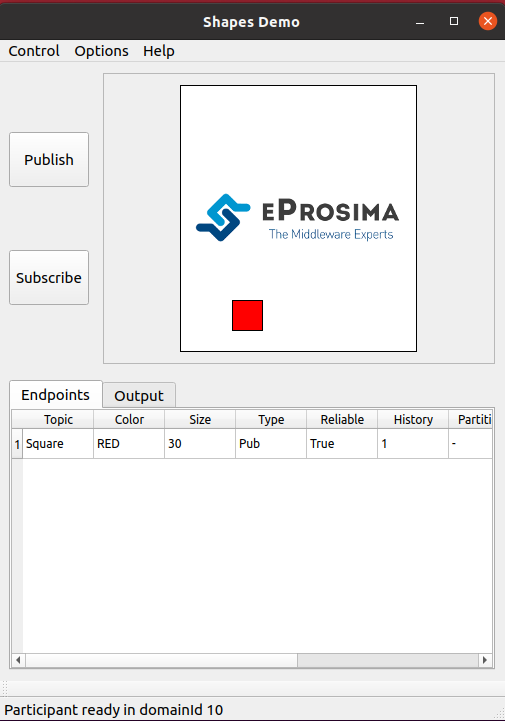
Let us run an instance of ShapesDemo, and start publishing under the Square topic.
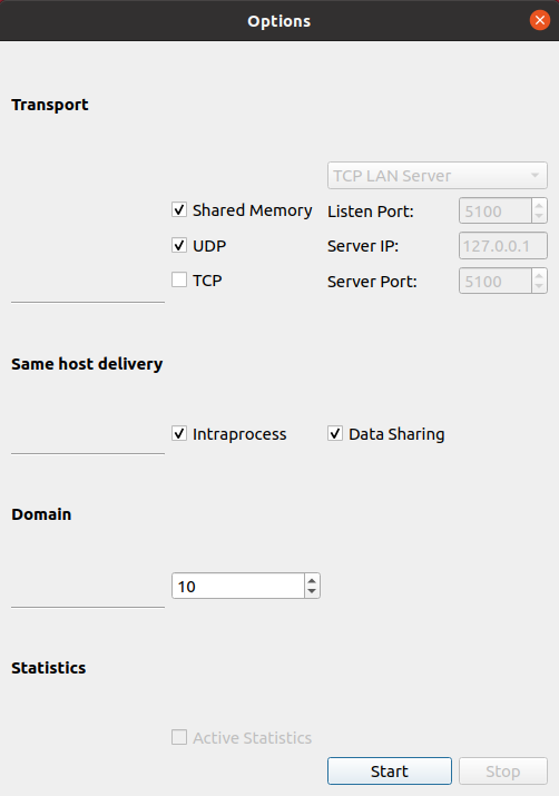
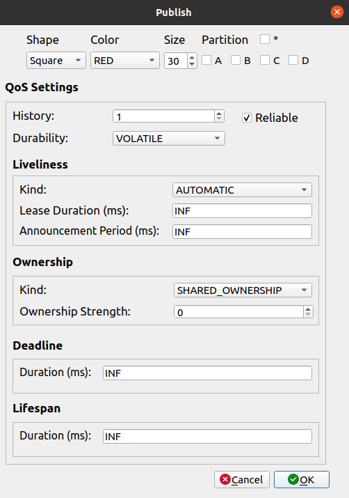
Choose the DDS domain on which data will be published (Options->Participant Configuration), and create a publisher with
default settings on this topic.
See Using eProsima Shapes Demo
for more details.
1.3. Visualize DDS data
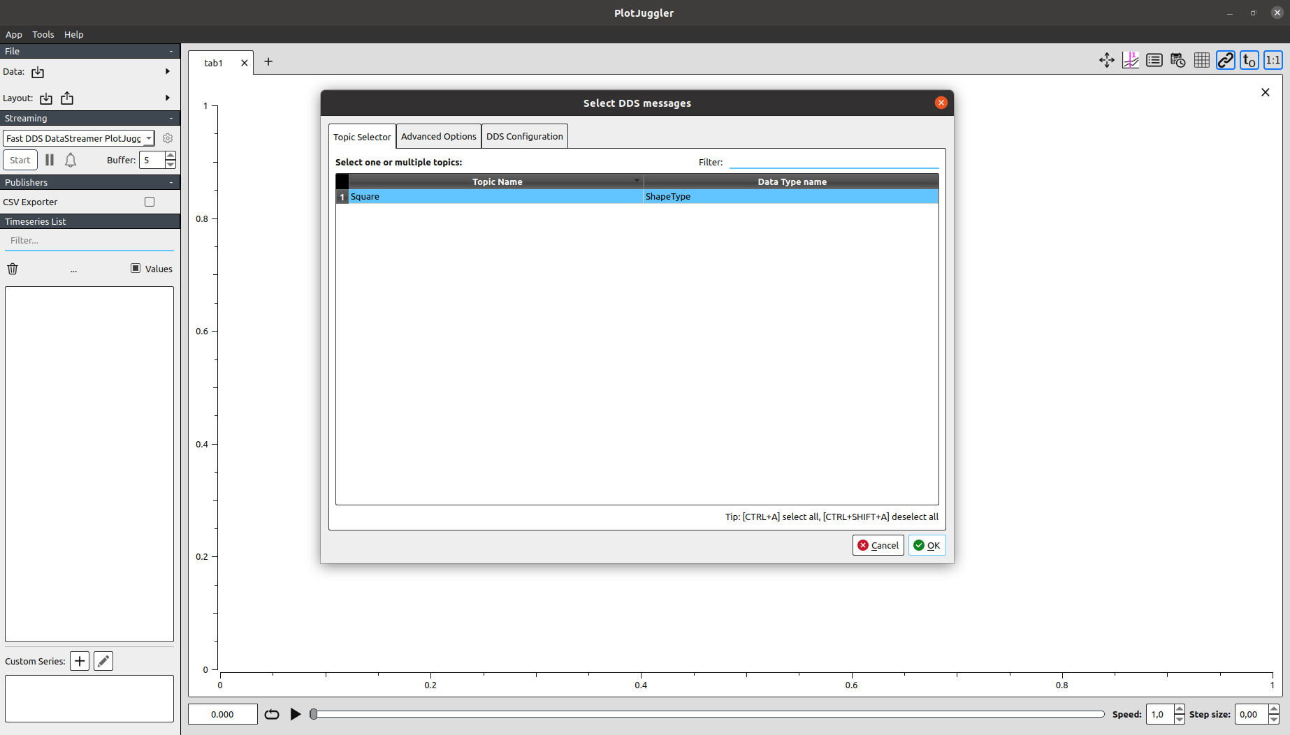
Run now Plotjuggler application, and start streaming data through the Fast DDS Visualizer Plugin. In the DDS configuration settings tab, select the same DDS domain as the one previously chosen in ShapesDemo.
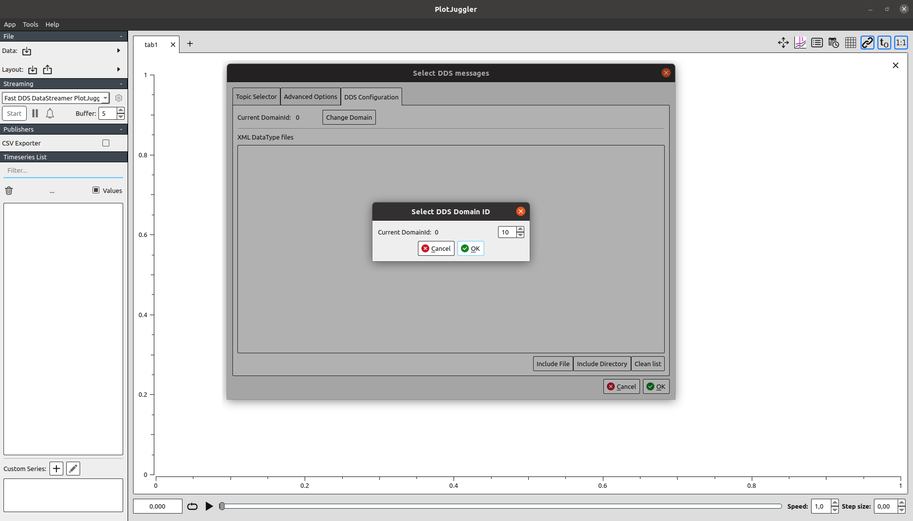
A row with the Square topic should be visible under the Topic Selector tab. Select it and hit the OK button to
proceed.
1.3.1. Plotting time series
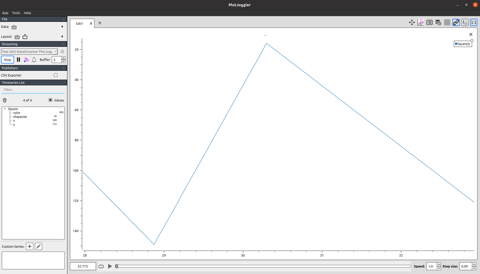
One can now plot, for example, the evolution in time of the y coordinate. Just drag and drop to the main panel
the corresponding entry appearing on the left column, and data should start being displayed right away.
It is rather confusing to interpret this particular time series, as in ShapesDemo the origin for this axis corresponds to the top of the grid, while in Plotjuggler it is depicted the other way around. This can be easily solved by flipping the Y axis (option available when right clicking over a plot).
1.3.2. X-Y curves
Still, it is not the most intuitive to interpret both series separately. Let us exploit another useful feature Plotjuggler brings to the table: x-y curves.
Create a new tab, select both x and y items from the Timeseries List, and drag them to the empty canvas, this
time using the right mouse button.
Again, flip the y axis to visualize the movement of the square shape, now closely resembling the one observed at
ShapesDemo application.
1.4. Next steps
We hope this example served as a useful resource for getting a grasp on the basics of eProsima Fast DDS Visualizer Plugin. Feel free to explore the User Manual section to learn more about its various features and configuration options.